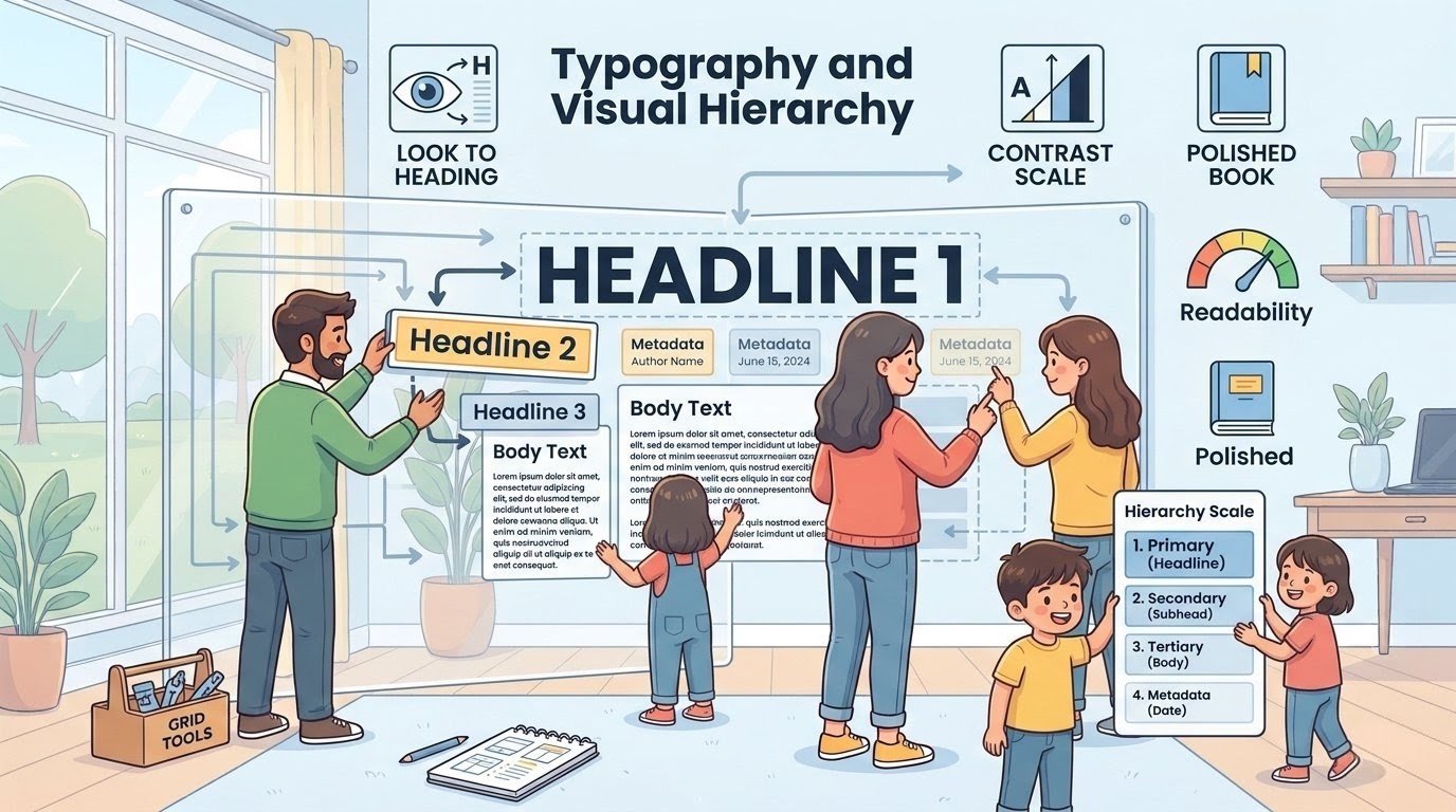
Typography shapes how readers perceive your content. A clear hierarchy tells them what to read first, what to read next, and what can wait. Headlines should be bold and prominent. Body text should be comfortable to read at any size.
When done well, typography guides the reader through the page without them even noticing. This layout uses contrast to create that hierarchy. The titles stand out clearly from the metadata below them.
The dates are smaller, lighter, and less prominent. That subtle difference helps the eye move naturally. It also makes the page feel more polished and professional. Good typography doesn’t just look better — it improves understanding.