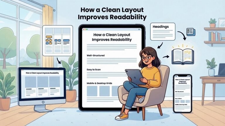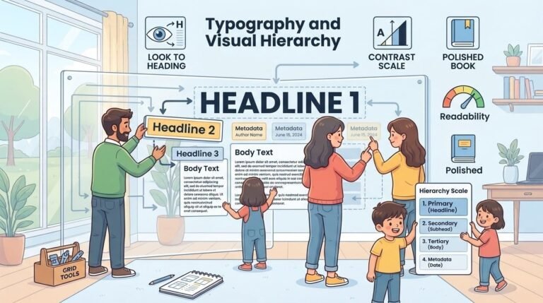
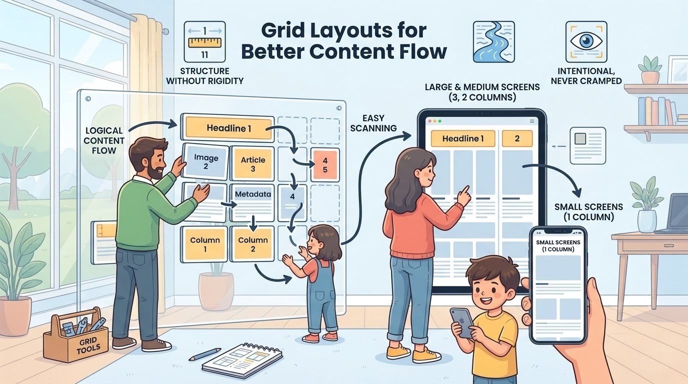
A grid layout creates structure without rigidity. It organizes content into columns and rows that naturally lead the eye across the page. Readers can quickly scan headlines, pick what interests them, and dive deeper.
That is why grids work so well for blogs and news sites. They turn a long list of posts into something more manageable. The trick is to keep the grid flexible.
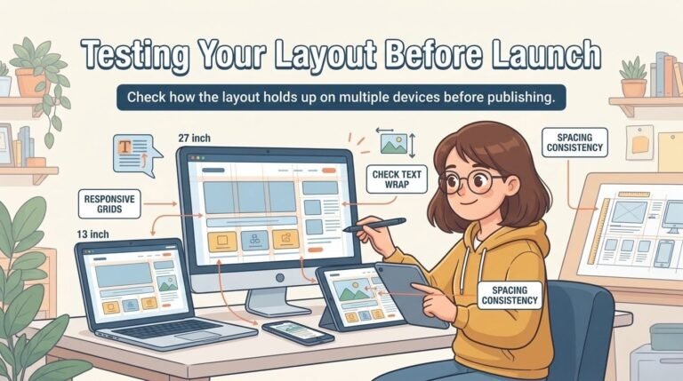
On a large screen, three columns work beautifully. On a medium screen, two columns are often better. On the smallest screens, a single column is the most practical choice.
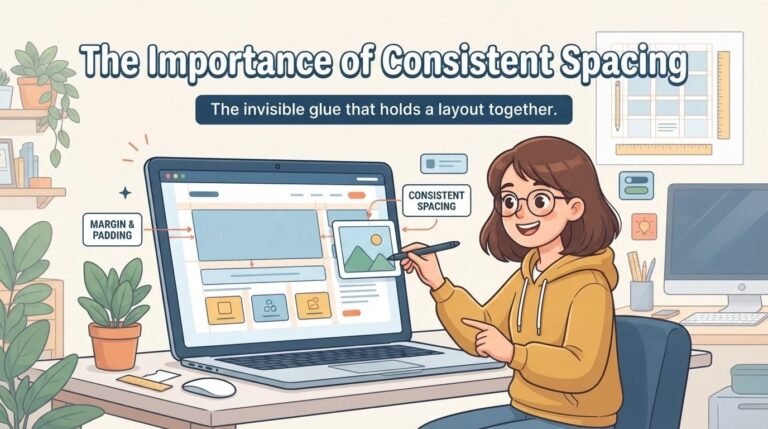
This responsive approach ensures that the layout always feels intentional, never cramped. The content remains the priority, regardless of the device.