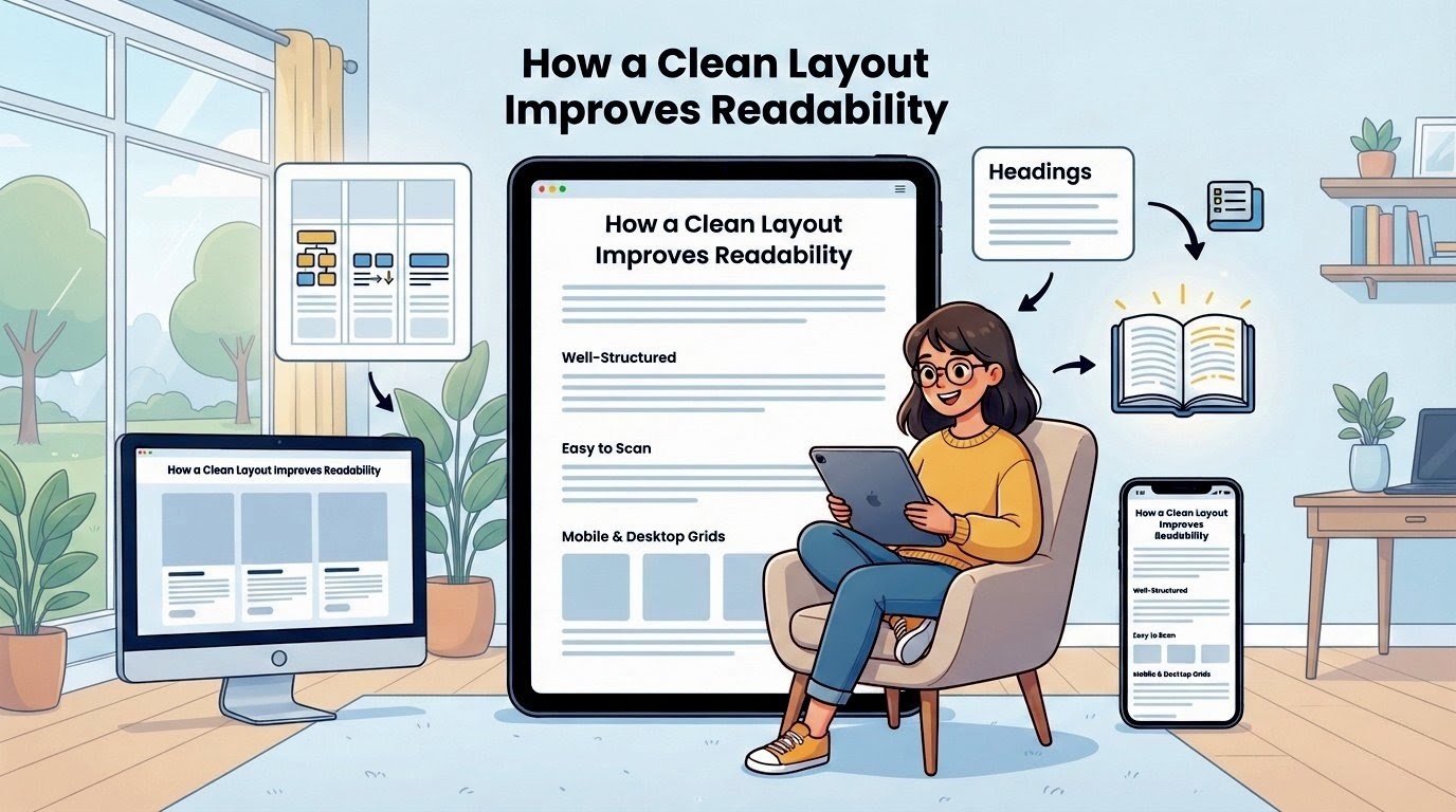
A well-structured layout helps readers focus on what matters. When content is easy to scan, people stay longer. They read more, and they return more often.
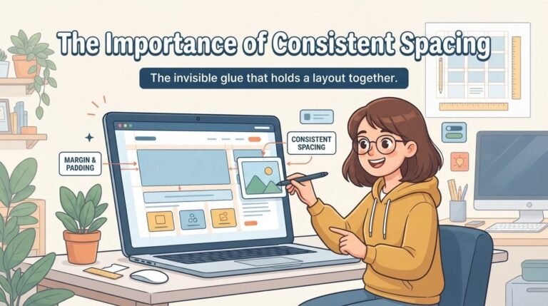
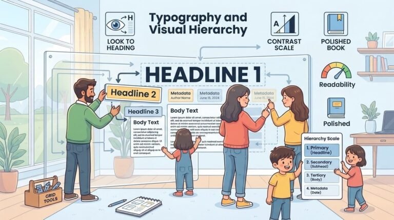
The design should guide the eye naturally from one section to the next. That means using enough white space, clear headings, and consistent spacing between elements. A cluttered page pushes people away. A clean one invites them in.
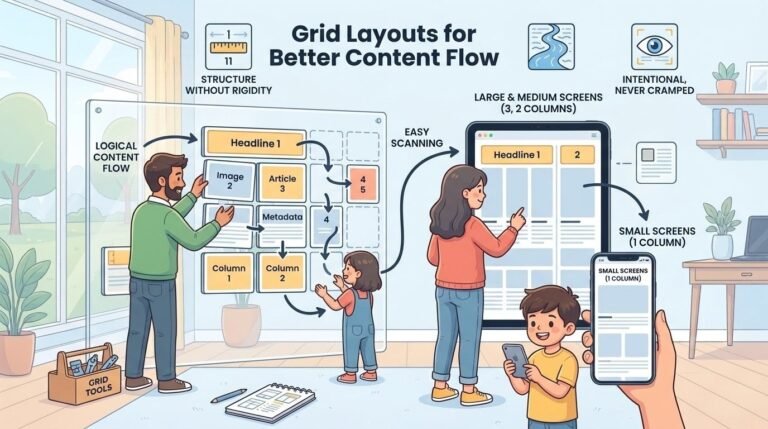
On mobile devices, this becomes even more important. Small screens leave little room for distractions. Every element must earn its place. This is exactly what a grid-based layout achieves.
It arranges content in a logical flow without overwhelming the reader. Whether you are using a three-column layout on desktop or a single column on mobile, the goal is always the same: make it easy to read. Good design doesn’t shout. It works quietly in the background.