More than half of all web traffic now comes from mobile devices. That means your layout must work well on small screens. If it doesn’t, readers will leave within seconds.
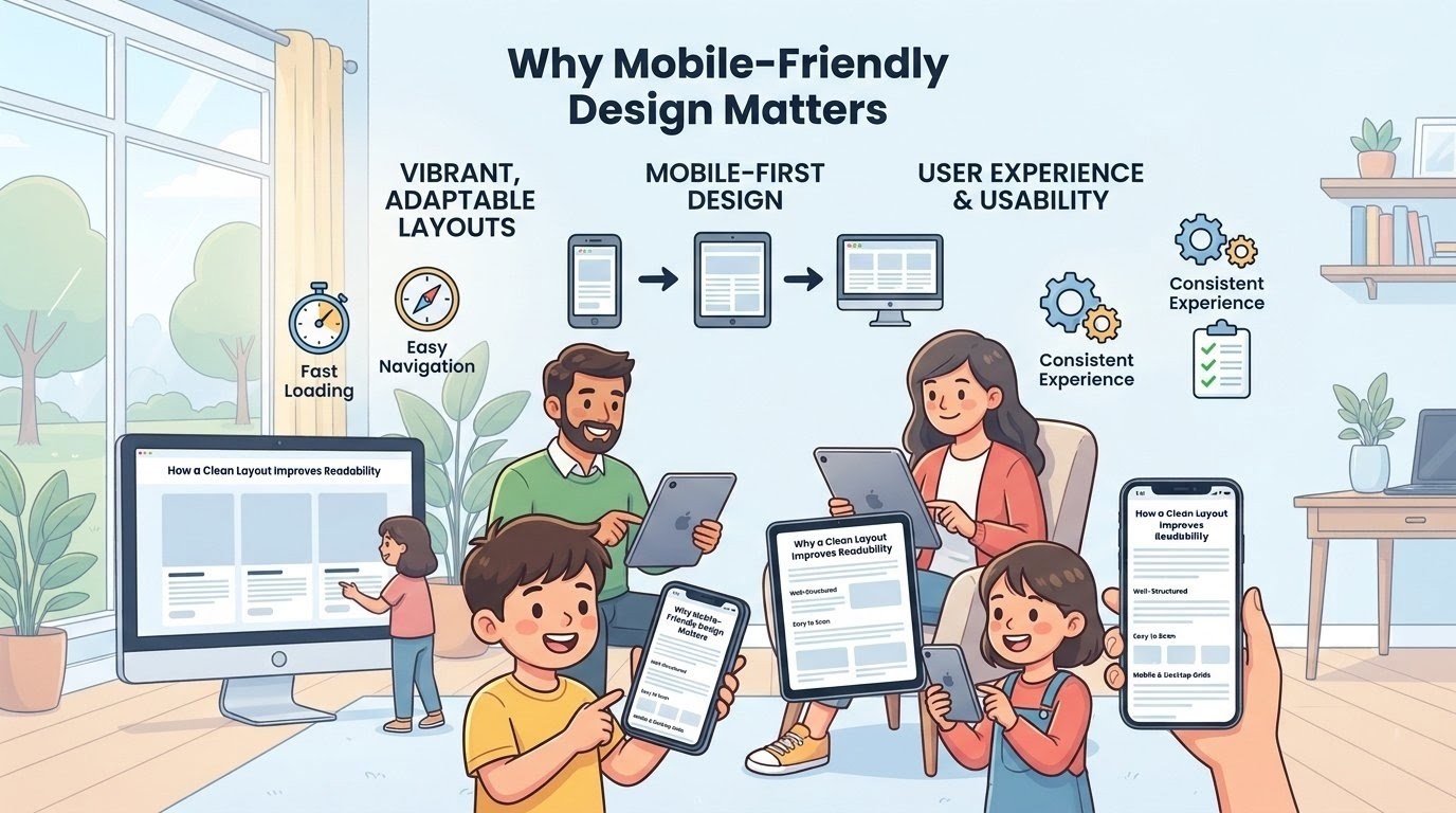
They won’t wait for images to load or text to resize. They expect everything to look right immediately. A mobile-first design starts with the smallest screen and scales up. That approach ensures nothing gets lost in translation between devices.
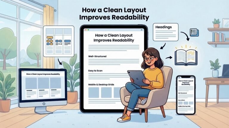
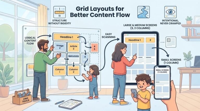
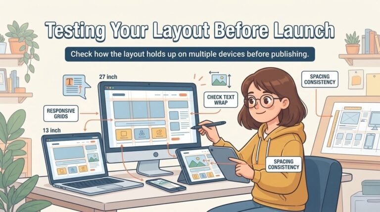
This is why the layout you see here adapts to different screen sizes. On a phone, each post appears one after the other. The text is large enough to read without zooming. The spacing is generous enough to tap easily.
On a tablet or desktop, the same content spreads across multiple columns. The experience stays consistent, but the presentation changes to match the device.